At the 2017 CES conference, the Zigbee Alliance, which focuses on IoT wireless communications, unveiled the new Internet of Things language system, Dotdot. This is a new wireless communication language that allows smart home appliances to work together under different network conditions. In other words, in the near future, you no longer have to worry about the fact that refrigerators that can only work in a wifi environment cannot cooperate with lights that can only work in a Bluetooth environment. They have a special language that allows for independent communication.
The Zigbee Alliance teamed up with brand design firm Wolff Olins to create a complete vision system for Dotdot, which was presented at CES with technology.
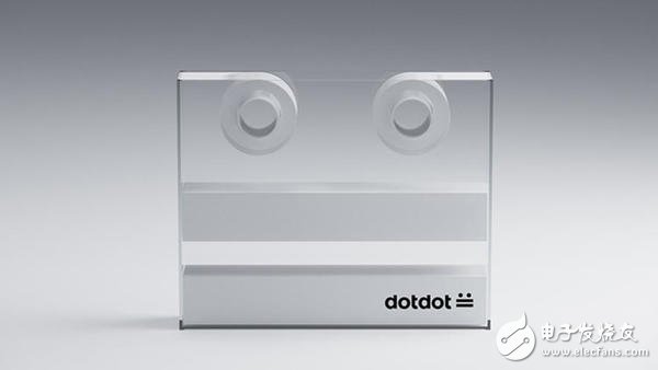
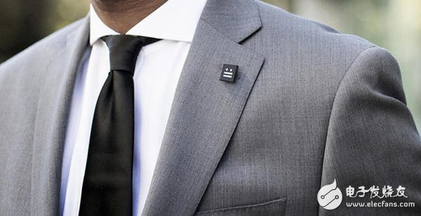
This logo is very simple. You can even type it out with your phone, it looks like this:
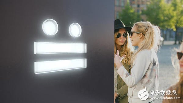
The full version is more like a very cute face.
Zigbee said to the new logo: "This time we are working with the Wolff Olins San Francisco office to design a vision system that will face both merchants and consumers. The final result is even a new breakthrough in technology. -- This is perhaps the first logo that can be easily drawn in CSS."
This is also a special feature of this logo: it can be in the form of a traditional AI or PDF file, but a string of characters hanging on Github that can be rendered in CSS. At the same time, it can also be output with two open source characters in the Google Universal Fonts project jointly developed by Google and Monotype this year.
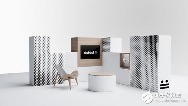
The separate logo design was not enough to bring a complete image to Dotdot, and Wolff Olins also produced a short video that visually introduced the features of the new language.
According to the design firm, the Dotdot Logo was inspired by Morse code – also consisting of points and lines. This has also been applied to the extended design and application of the logo.
“We discussed how language exists because we are designing for a language. One of the topics is: How does language evolve? It is clear that it is becoming more and more visual,†said Wolff Olins, San Francisco office. People Forest Young said.
He said that choosing an emoji is at least interesting or modern, and involves the development of today's language, and their meaning and image may be completely subverted or developed into new branches tomorrow. “Logo is not sacred and inviolable. This is the traditional brand image of the past. If Logo is a trademark and trademark is a language, then language is evolving.â€
Wolff Olins, part of Omnicom, is one of the world's leading design consultancy companies founded in 1965 by Michael Wolff and Wally Olins. They designed the controversial logo and vision system for the 2012 London Olympics. Now, Wolff Olins is made up of a group of designers, strategists, technicians, project managers and educators.
Power Meter,Energy Meter, Best power meters,Cycling Power meters,Electrical power meter
NINGBO COWELL ELECTRONICS & TECHNOLOGY CO., LTD , https://www.cowellsocket.com